Google redesigns its Mobile Search pages to be easier to read
Google Mobile Search is getting a brand new design, featuring a more modern look and providing easier-to-read search results.
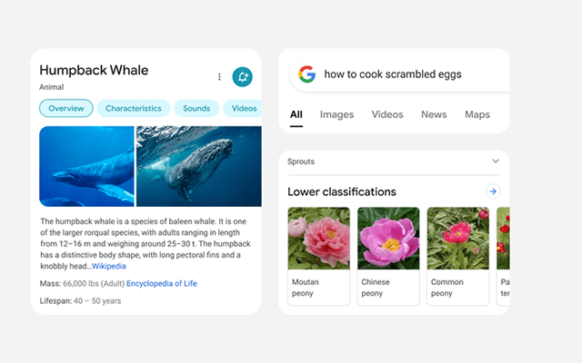
Google, on January 22th, unveiled a significant redesign of its mobile search pages. The idea here is to display easier-to-read search results plus a more modern look with an edge-to-edge design.
With the new design of mobile search, Google aims to offer a better experience for users in 3 major ways of easy reading, simpler design, and modern approach.
Google’s Mobile Search Redesign (Image Source: Blog. google)
Five major elements that drove the redesign of Google’s mobile search experience
The new-look keeps things clear and simple. And here are five major things included in Google’s Mobile Search redesign, according to Google’s announcement:
-
Bringing information into focus: Simplifying the experience and getting users to information and content they are looking for as quickly and clearly as possible is a part of the redesign.
-
Making text easier to read: Using larger, bolder text throughout the design to help users scan the search results faster and easier.
-
Creating more breathing room: By using fewer shadows and especially featuring a new edge-to-edge results design, there’s more visual space and breathing room for Google’s mobile search results to take center stage.
-
Using color to highlight what is important: The new version of design features a more intentional use of color to better guide the eye to important information.
-
Leaning into that “Googley” feeling: This redesign will also deliver a little “bubblier and bouncier” feeling. It borrows from the Google logo’s roundness and makes icons as well as other imagery more round. Google believes that this feels familiar and approachable.
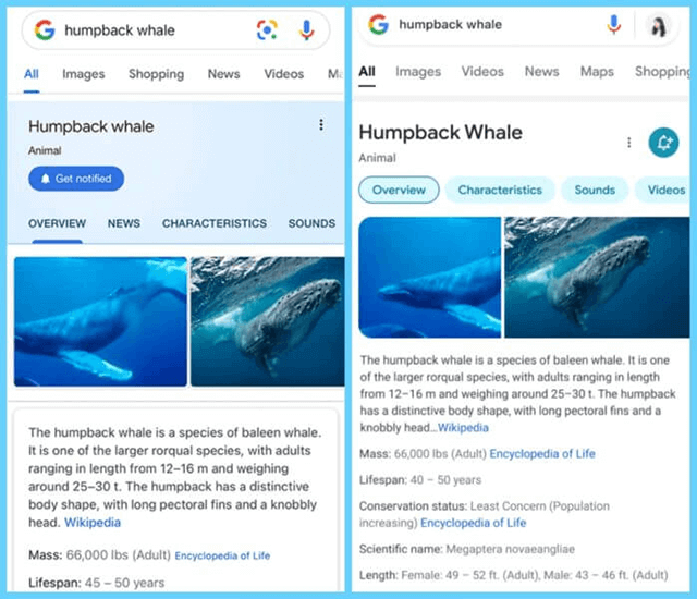
Here’s what Google’s Mobile Search redesign looks like as compared to its older version:
The new mobile knowledge panel design (right) and the old one (left) (Image source: searchengineland.com)
Besides, the difference between the new and old new mobile search result snippets can be seen here, though it is subtle.
The new mobile search result snippets (right) and the old ones (left) (Image source: searchengineland.com)
Note that this update only affects the look and feel of Google’s mobile search pages. There is no change to how content is ranked or indexed, how much information is included in the search snippets, or anything like this.
For more details related to Google Search’s mobile redesign, you can check out Google’s official blog post at https://blog.google/products/search/mobile-redesign-2021.
Sources:
blog.google/products/search/mobile-redesign-2021
searchenginejournal.com/google-redesigns-mobile-search-results/393344/


.jpg)


0 Comments
Leave a Comment
Your email address will not be published. Required fields are marked *